If money is the object, payment is the force. Payment puts money to work. So, less the friction in the process of making payments, the easier it is to put money to work.
One would think that making payments online should have been solved for well beyond doubt in 2023 but one would need to think again. Here are a few checkout experiences that caused me to drop off.
I’m evaluating checkout experiences across popular websites on these four categories:
- Presentation of payment methods
- Handling of user inputs
- Copywriting on the checkout page
- Navigation on the payment sheet
Let’s jump right in!
Presentation of payment methods
Perhaps the most under noticed phenomenon in fintech over the last decade is the commoditization of payments. A decade ago, it was super revolutionary to accept payments online with a few lines of code. That is not the case any more. Commoditization of payments has led to a sharp increase in the diversity of payment methods.
How you present payment methods to your customers on the checkout screen matters a lot. Unfortunately, there is no one right way to do it. However, there are a few things to be mindful of:
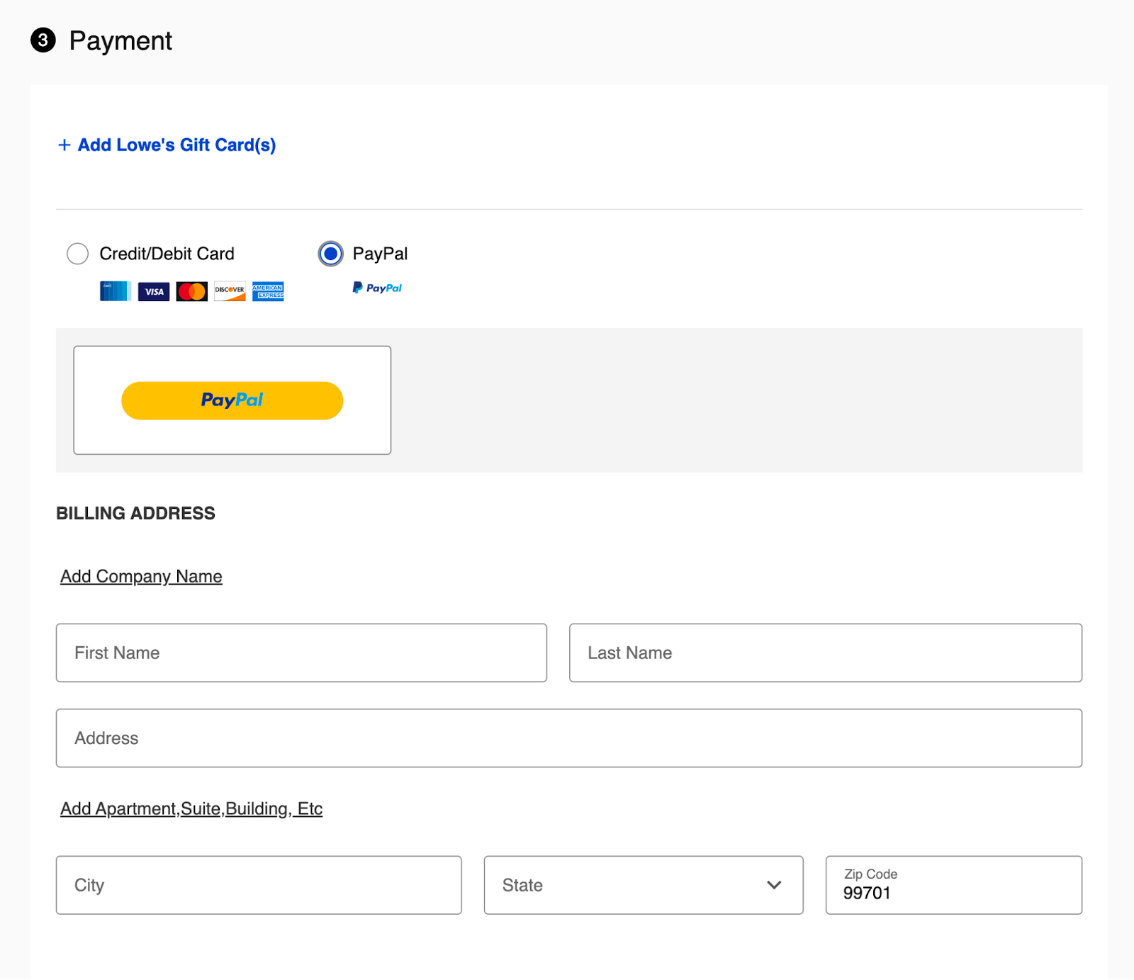
Order of payment methods:
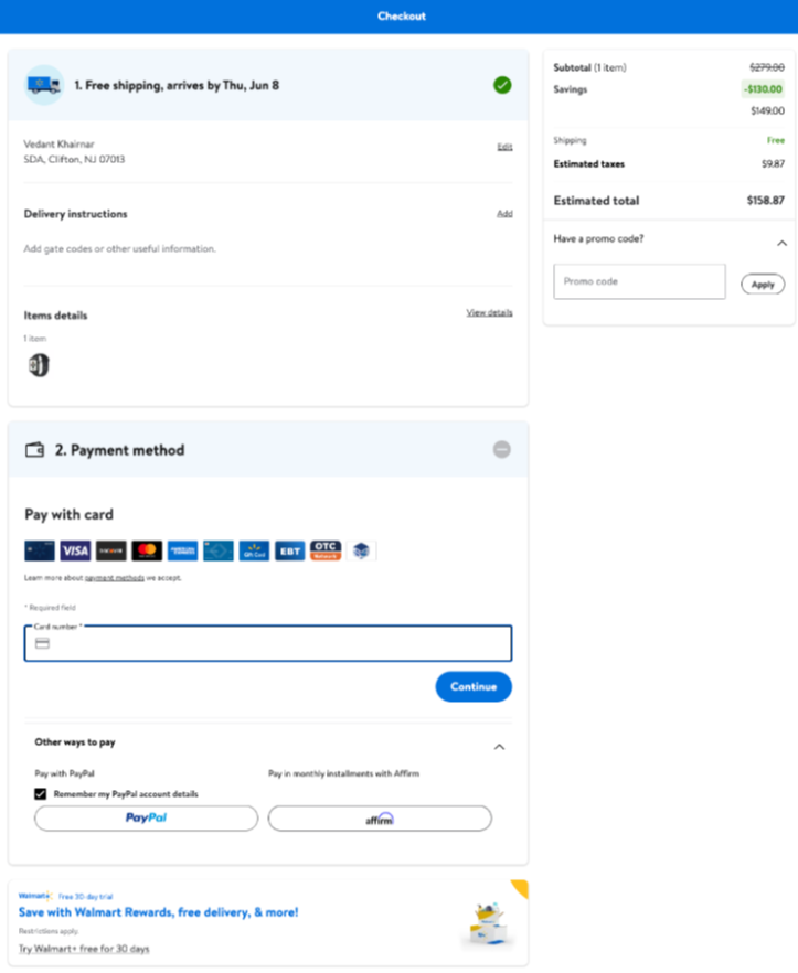
The order in which you present your available payment methods can directly impact your conversion rates by 5-8%. This is usually a tradeoff between processing fees and conversion rate. The only question you will have to answer is whether it is worth promoting the more expensive payment method if it offers a better checkout experience (and a better conversion rate). Here’s an example from Walmart where the Paypal one click checkoutcan be presented above the card form or even alongside the checkout button that brings the user to this payment page.
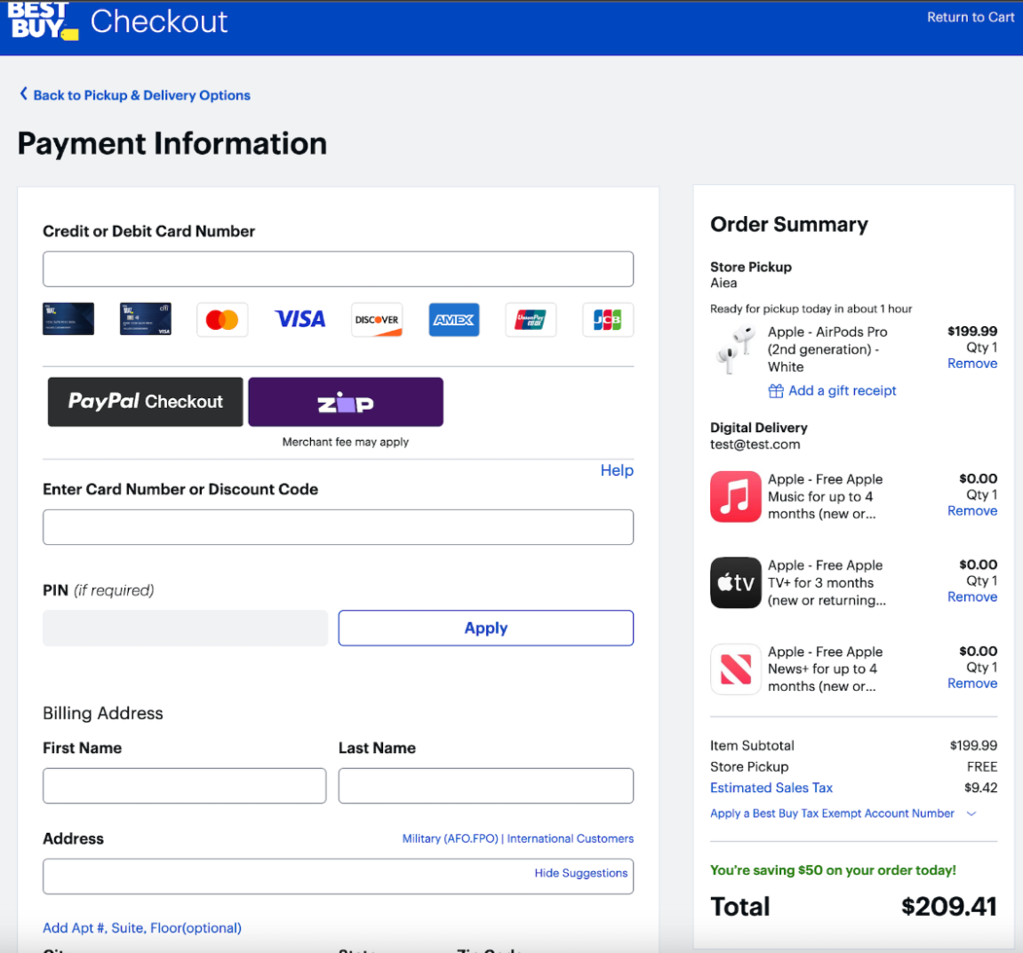
Progressive disclosure of payment details:
While progressive disclosure is usually a good idea to make your user get a feel of your product while onboarding, it does not make any sense to do that for card payments. Why would you display only the card number input field at the start? In this case it is better to display all the card input fields because that would make the UI look more like the card itself (in terms of the arrangement of the card number, expiry and CVV). Also, these pages display the card brands like they are clickable icons which is not the best way to do it.
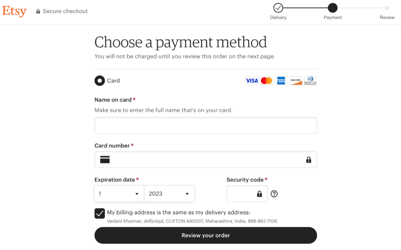
Here’s a much simpler way to do it (bonus points for the dropdown on expiry date):
Handling of user inputs
How complex can typing a few words inside an input field be? Well not that hard to be honest. But here’s how you can mess it up:
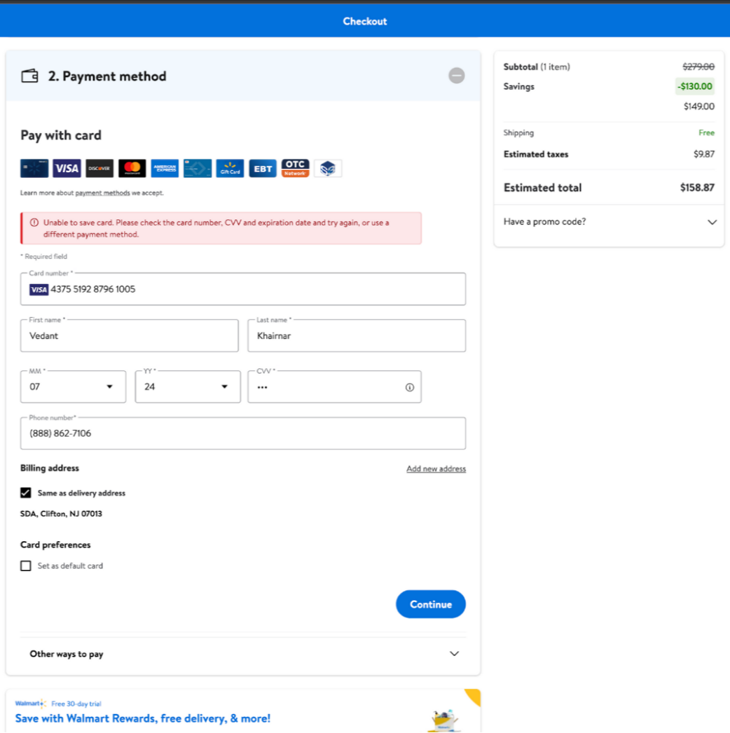
- Not having dynamic error validations before someone goes ahead with the payment. It is as simple as using the Luhn algorithm to make some basic checks.
- Don’t display card numbers in a standard format
- Make it hard to search for billing / shipping addresses
- Provide the same generic error messages for all kinds of errors
Copywriting on the checkout page
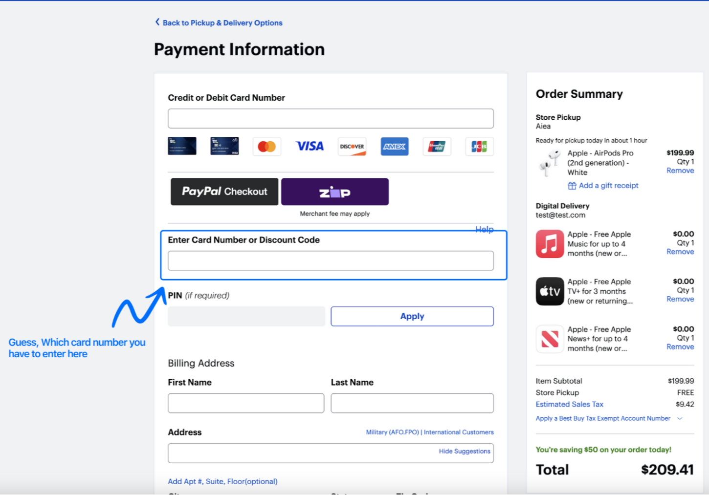
Here’s a question: What do you think you should enter in the highlighted field? If you guessed that it should be your debit / credit card number like a normal person, you are wrong. That input field is actually referring to some kind of a gift card number
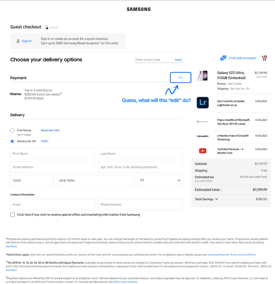
Here’s another one: What do you think the ‘Edit’ button does? Turns out that in this case, it is a toggle for changing your payment method. Why not keep it simple and just display the available payment methods upfront?
Navigation on the payment sheet
Some payment methods might ask for multiple inputs from the user and the number of steps involved might not be directly in your control. However this is not the case for common payment methods like cards. Here’s how you can get it wrong:
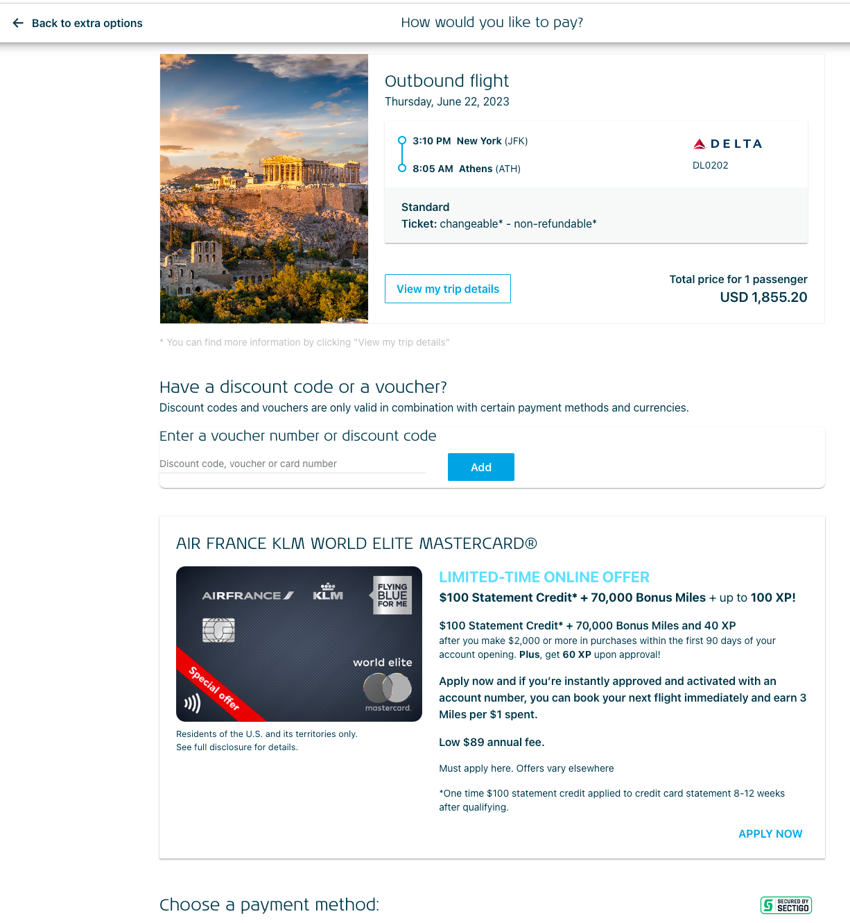
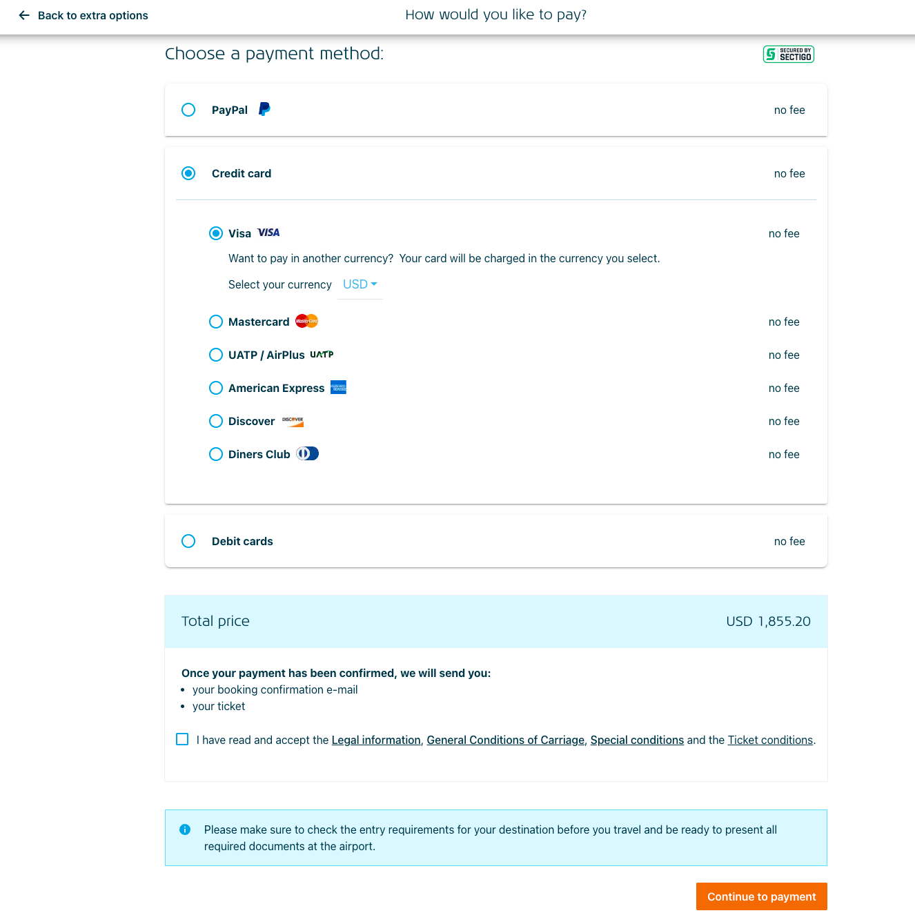
So 2 scrolls, 4 clicks and a new page before I enter my card details? Seriously? A lengthy checkout page equals a bad payment experience. It worsens on a mobile screen where you have to scroll multiple times, just to see the payment options. Plus, I need to enter my card type (credit/ debit), then select the card network (Visa, Mastercard, etc.). Why can’t this be detected from my card number?
On clicking Continue to Payment, I’m taken to a new page where I have to enter the card details. On this new page, I have to spend additional energy and time to re-check my order details (because it’s natural to be cautious for a high value purchase) and then proceed. It would have been a better experience to enter the card details on the first page itself, where I had first checked the order details
Keeping it simple
Maybe the worst mistake you can make is to optimize something that should not exist in the first place. You have already done a great job bringing your customer till the final checkout page. So it’s best to keep it as simple as possible. Maybe you don’t need to wrap a payment method inside multiple boxes. Maybe you just need to let it be.
Want to contribute?
- Check out some of our good first issues here.
- Try Hyperswitch. Get your API keys here.