A complicated checkout process deters 17% of shoppers(as per a survey by hotjar).
Today with so many options available to the people, every click counts, optimizing your checkout process is like fine-tuning the engine of your online store. One critical metric that defines success in this realm is the checkout conversion rate. In this blog post, we will demystify the nuances of checkout process optimization and explore practical tips to enhance your conversion rate, after all we don't want to lose any customer at the last moment.
What is Checkout Process Optimization?
Before diving into the tips, let's take a moment to understand what checkout process optimization means. At its core, checkout optimization involves refining the steps a customer takes from adding items to their cart to completing the purchase. It's about creating a seamless and user-friendly experience that minimizes friction and encourages visitors to become paying customers.
The checkout process is the make-or-break moment in the customer journey. Imagine a physical store where customers abandon their shopping carts just before reaching the cashier. The online checkout process is no different. Whether it's a complicated form, unexpected fees, or a lack of trust, any hiccup in the process can result in abandoned carts and lost sales.
In the digital realm, the checkout process is a series of pages where customers enter their shipping information, payment details, and complete the purchase. Optimization involves streamlining these pages, eliminating unnecessary steps, and addressing potential obstacles that may deter customers.
Tips for Checkout Optimization to Improve Conversion Rate
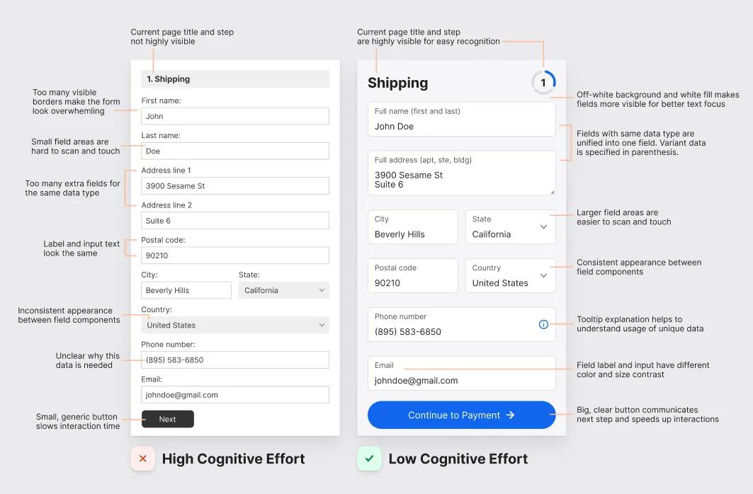
Simplify the Form
One of the first steps in optimizing your checkout process is to simplify the form-filling experience. Long and complicated forms can be a major turnoff for customers. Aim to collect only the essential information needed to process the order. If possible, provide an option for guest checkout, allowing customers to complete their purchase without creating an account.
User Tip: Consider implementing an address autocomplete feature to speed up the process for users and reduce the likelihood of errors.
Clear Call-to-Action Buttons
The buttons guiding users through the checkout process should be crystal clear. Use action-oriented words like "Proceed to Checkout" or "Complete Purchase" to leave no room for ambiguity. Ensure that these buttons stand out visually, using contrasting colors that catch the user's attention.
User Tip: Test different button colors and placements to see which combination resonates best with your audience.
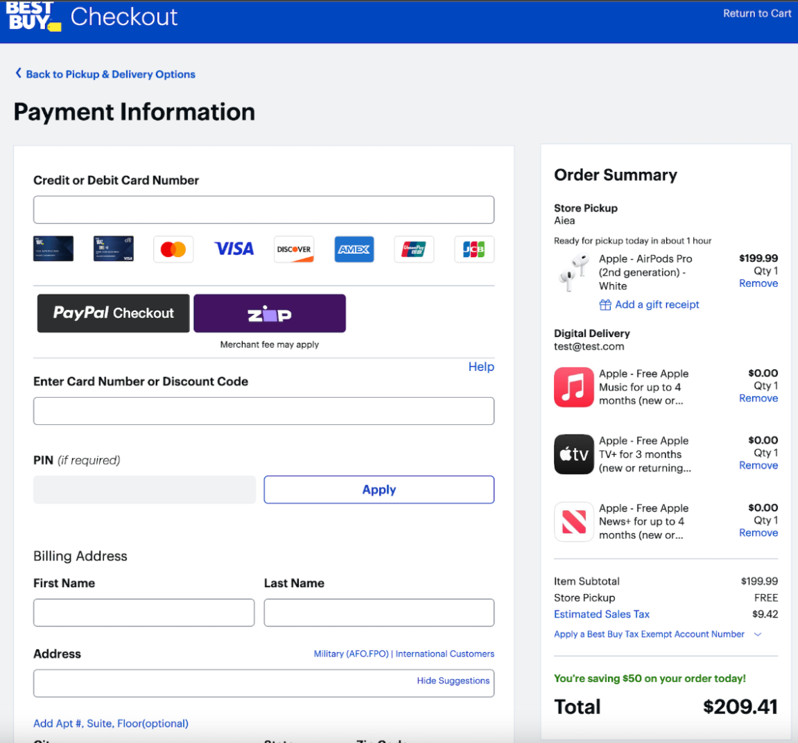
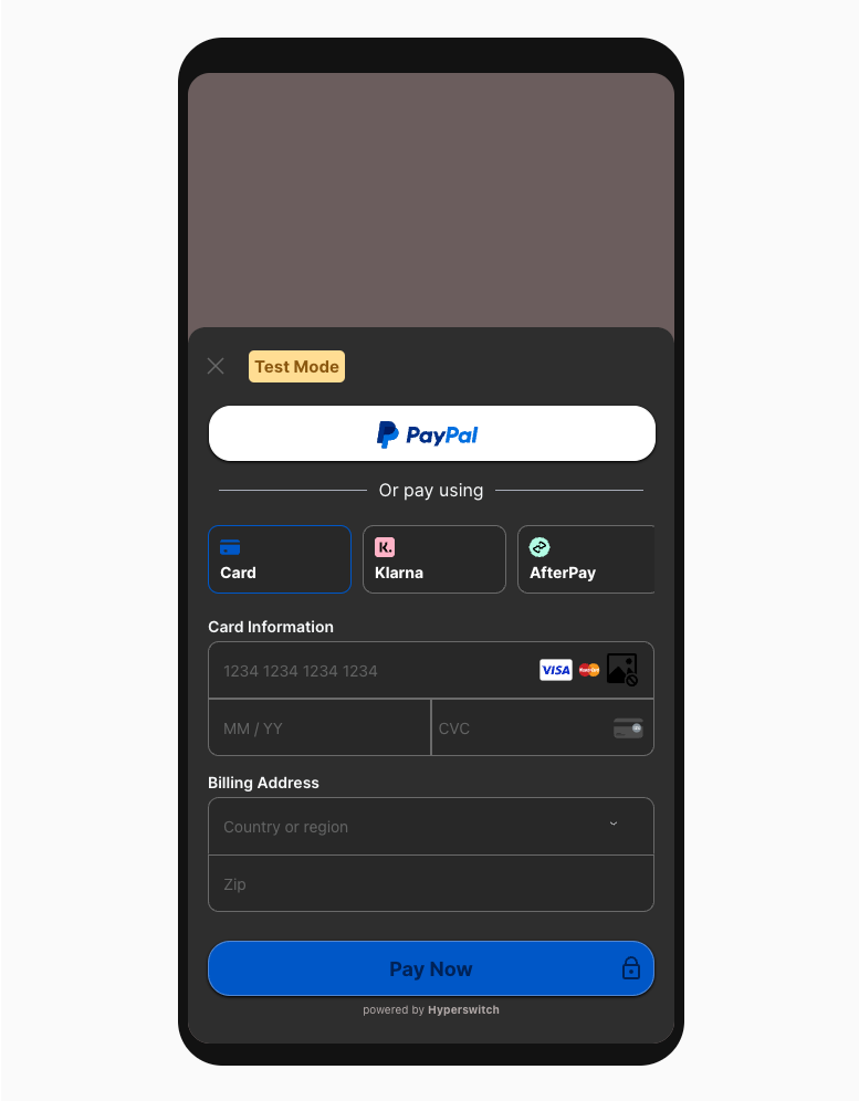
For example, this page displays the card brands like they are clickable icons which is not the best way to do it.
Display Progress Indicators
Nobody likes surprises, especially during the checkout process. Implement a progress indicator to let customers know how many steps are left before completing their purchase. This transparency provides a sense of control and helps manage expectations.
User Tip: Consider using a percentage-based progress bar to visually represent the completion status.
Optimize for Mobile Devices
With a growing number of users shopping on mobile devices, it's crucial to ensure that your checkout process is mobile-friendly, especially the payment page. Optimize the design and functionality to provide a seamless experience on smartphones and tablets. Mobile users should be able to navigate through the process effortlessly, without compromising on security or functionality.
User Tip: Test your checkout process on various devices to identify and address any issues specific to certain platforms.
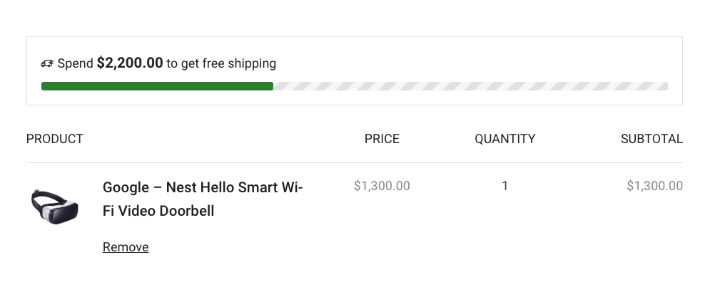
Offer Multiple Payment Options
Different customers have different preferences when it comes to payment methods. By offering a variety of global payment options, including credit/debit cards, digital wallets, and other popular methods, you cater to a broader audience. This flexibility can significantly reduce cart abandonment rates.
User Tip: Research your target audience to understand their preferred payment methods and prioritize integration accordingly as shown above.
Provide Trust Signals
Building trust is paramount in e-commerce, especially during the checkout process where customers share sensitive information. Display trust signals such as security badges, SSL certificates, and recognizable payment icons. Additionally, consider including customer testimonials or reviews to instill confidence in your brand.
User Tip: Highlight any industry certifications or security measures you have in place to protect customer data.

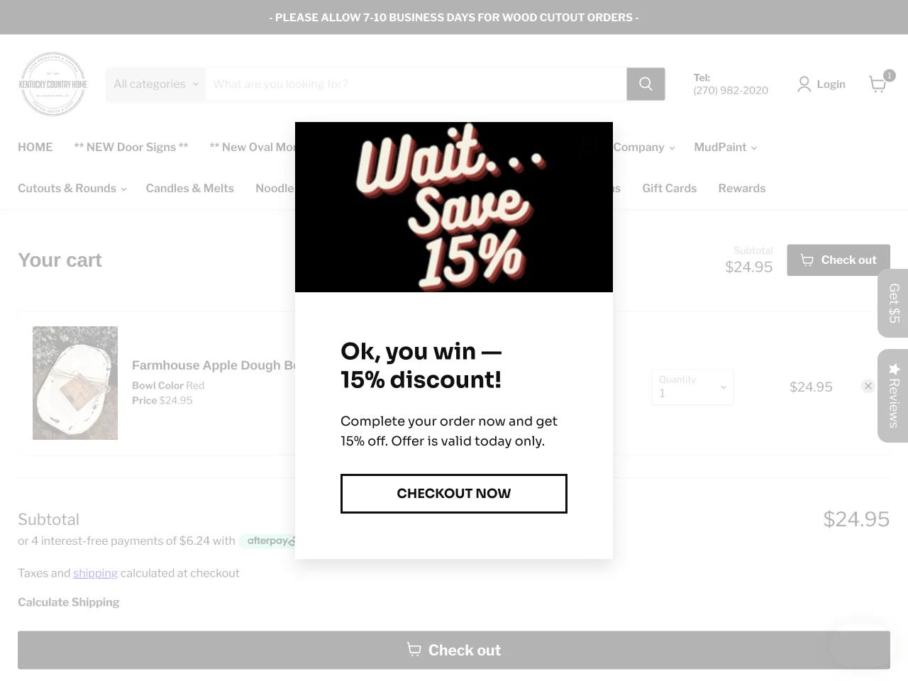
Implement Exit-Intent Popups
An exit-intent popup is a last-ditch effort to retain a potential customer who is about to leave your site. Use these popups strategically to offer a discount, free shipping, or other incentives to encourage users to complete their purchase. However, be mindful not to overwhelm users with intrusive popups.
User Tip: Test different incentives to see which resonates best with your audience and results in higher conversion rates.
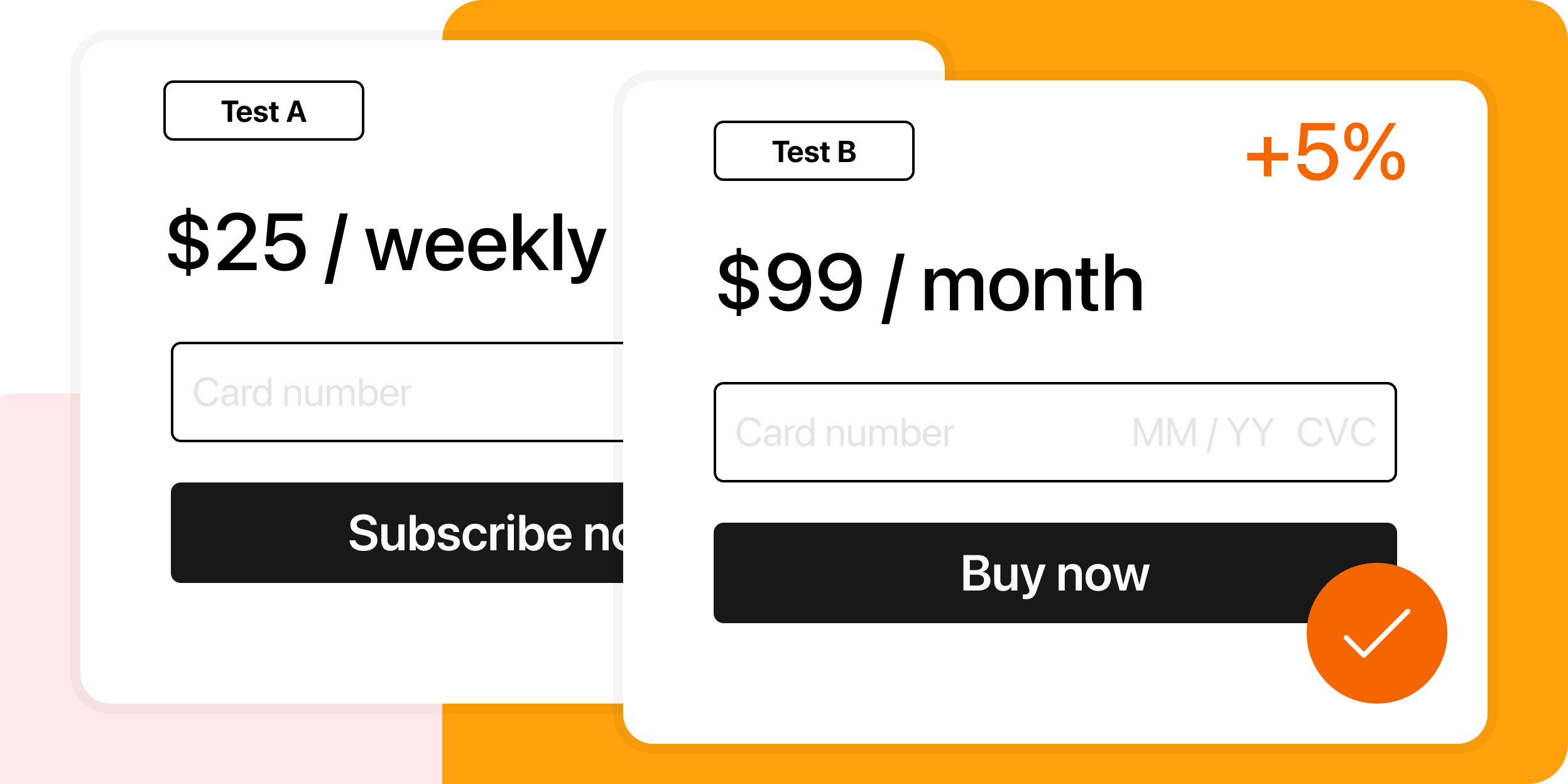
Leverage A/B Testing
Every online store is unique, and what works for one may not work for another. A/B testing involves creating two versions of a webpage (A and B) with slight variations to see which performs better. Apply this approach to different elements of your checkout process, such as button colors, form fields, or payment options for global audience.
User Tip: Regularly conduct A/B tests to refine your checkout process based on real user data and feedback.
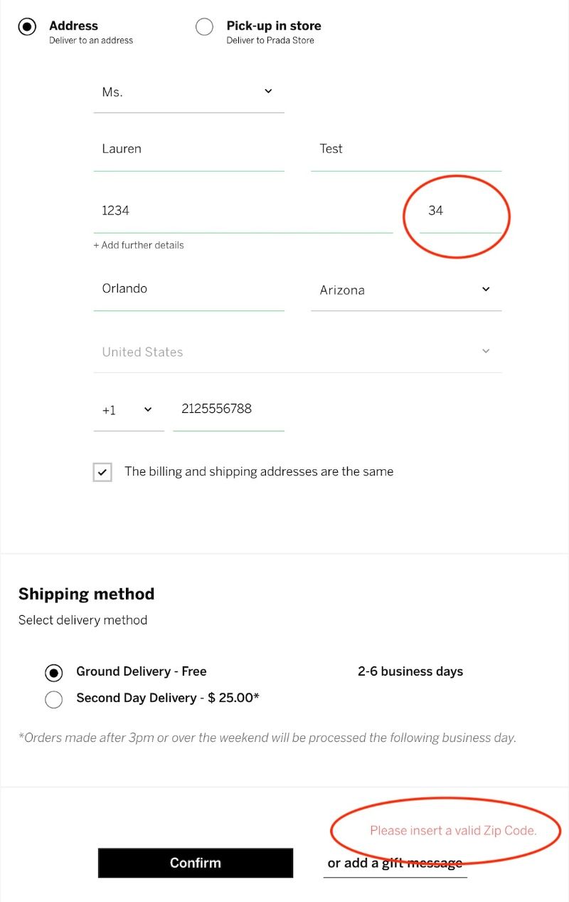
Streamline Error Handling
Errors are inevitable, but how you handle them can make a significant difference. Clearly communicate any errors to users, offering guidance on how to rectify the issue. Avoid generic error messages and provide specific instructions to minimize frustration and confusion. Following is an example of frustrating error handling.
User Tip: Monitor error patterns and use the insights to proactively improve the checkout process and eliminate recurring issues.
Conclusion
Optimizing your checkout process is an ongoing journey rather than a one-time task. Regularly assess your analytics, gather user feedback, and stay informed about industry trends to adapt and refine your approach. By implementing these tips, you can create a checkout experience that not only boosts conversion rates but also fosters trust and loyalty among your customers.
FAQ
How often should I update my checkout process?
Regularly assess your checkout process based on user feedback and performance metrics. Aim to make incremental improvements rather than drastic changes, and keep an eye on industry trends for inspiration.
What is the ideal length for a checkout form?
The ideal checkout form is concise and collects only essential information. Aim for a balance between gathering necessary details and providing a frictionless experience. Test different form lengths to find the optimal solution for your audience.
How can I convince customers to create an account?
Offer incentives for account creation, such as exclusive discounts, personalized recommendations, or faster checkout for returning customers. Clearly communicate the benefits of creating an account to encourage users to sign up.
What should I do if customers abandon their carts?
Implement strategies to recover abandoned carts, such as sending reminder emails with personalized incentives, addressing common reasons for abandonment, and optimizing the checkout process based on user feedback.
Is it necessary to display trust signals on the checkout page?
Yes, displaying trust signals is crucial to instill confidence in customers. Security badges, SSL certificates, and recognizable payment icons help establish trust and credibility, reducing the likelihood of cart abandonment due to security concerns.